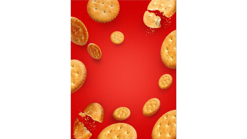
Packaging Design

Challenge

In the biscuit industry, Cremica offers high-quality products to their vast audience in the international market of US and Canada. The request was to design their packaging in such a way which is appealing to the consumers and define the product along with its quality.

Solution

Our agency designed several packaging concepts for various products such as Krack Bite and many more. The packaging reflects their product essence and attributes, and also defines the premium quality which is being addressed to the international market.

The new packaging worked as a goodwill booster for Cracker Biscuit, as they were able to entice the target audience. The specific color scheme in their packaging was used after studying the psychology of colors, which eventually skyrocketed their sales.

Cracker Font Sketches

Final Digital Sketch

Packaging Sketches

Option 1

Option 4

Option 2

Option 5

Option 3

Option 6

Final Option

IMPACT

The new packaging worked as a goodwill booster for Cracker Biscuit, as they were able to entice the target audience. The specific color scheme in their packaging was used after studying the psychology of colors, which eventually skyrocketed their sales.

Related Work